Product Design at Appspace
I joined Appspace as Product Designer in November 2021 following the acquisition of Beezy, where I contributed to integrating two distinct workplace platforms: Beezy's social intranet layer for Microsoft SharePoint and Appspace's digital signage and space management solutions. The vision: a unified workplace experience platform, to help employees connect both physically and digitally.
Over four years, I've led features of different product lines as well as cross-platform integration, while navigating the complexities of organizational change and product unification. These are some selected projects I've been leading during my time at Appspace.
Content Approval System
Problem
Enterprise clients in regulated industries required content review capabilities before publication. The challenge was designing an approval workflow that met compliance needs without creating bottlenecks in the content creation process.
Approach
I conducted user interviews with internal communications professionals to understand existing approval workflows. This research revealed a disconnect between my initial assumptions about formal review processes and the reality of how organizations actually manage content approval.
Research Insights
Through user interviews and thematic analysis, I uncovered critical gaps between my initial design assumptions and actual user needs.
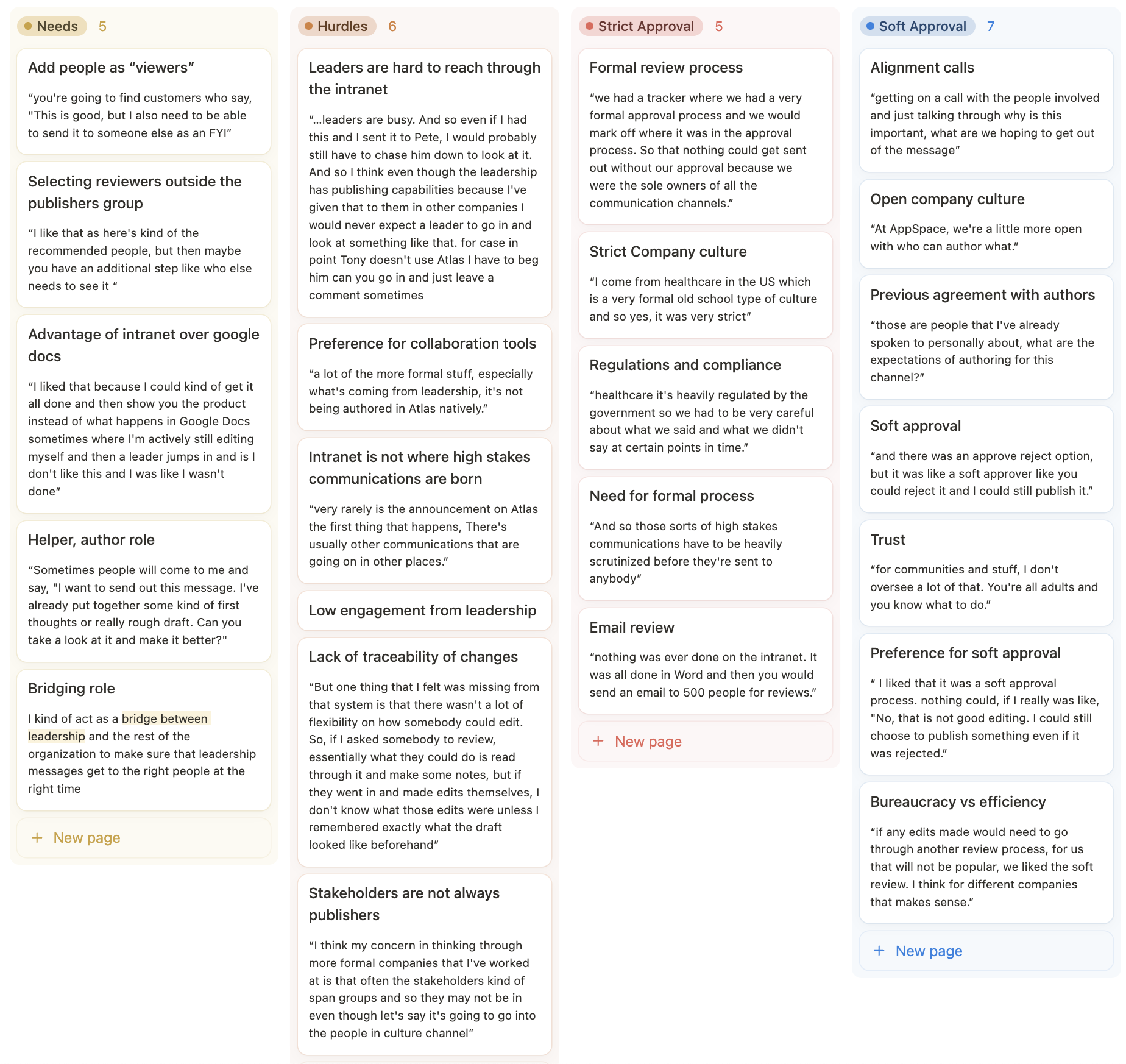
The research revealed two distinct approval patterns in enterprise environments:
-
Rigid approval workflows require content to restart the entire review process after each revision. This creates bottlenecks and delays that stakeholders described as highly inefficient. It might still be necessary for high-stakes communications like layoffs or mergers, but those kind of communications are not generally authored on our product originally.
-
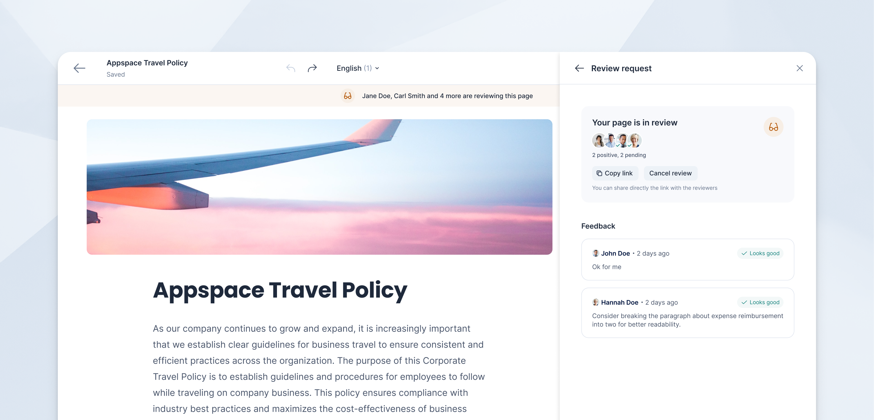
Collaborative approval workflows allow reviewers to provide input while maintaining author autonomy over final publication decisions. This approach accommodates busy stakeholders and maintains content velocity. More like a "Can you check this?" type of soft approval flow.
An initial concept involved publishers (owners) of channels being the default reviewers. This would have meant that each channel the content is published would have had a separate review process.
Key findings:
-
Reviewer scope limitations: My initial design restricted reviewers to channel publishers, but real-world scenarios require flexibility to include stakeholders outside the core publishing team (e.g., executives for sensitive announcements).
-
Engagement patterns: Senior stakeholders often lack bandwidth for detailed in-app review processes, requiring lightweight feedback mechanisms rather than complex commenting systems.
-
Content criticality varies: High-stakes communications (mergers, layoffs) require different approval rigor than routine updates, suggesting the need for flexible workflow configurations.
Solution
Based on research insights, I redesigned the approval system around flexibility and user behavior rather than rigid compliance structures
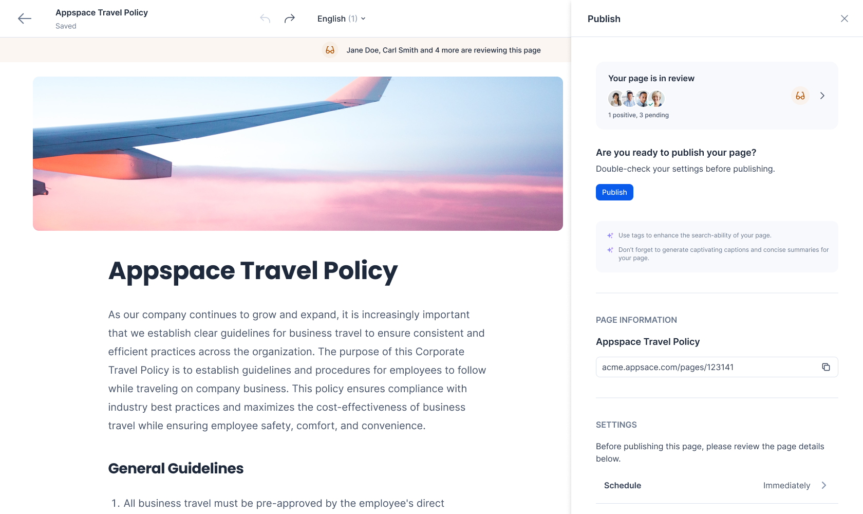
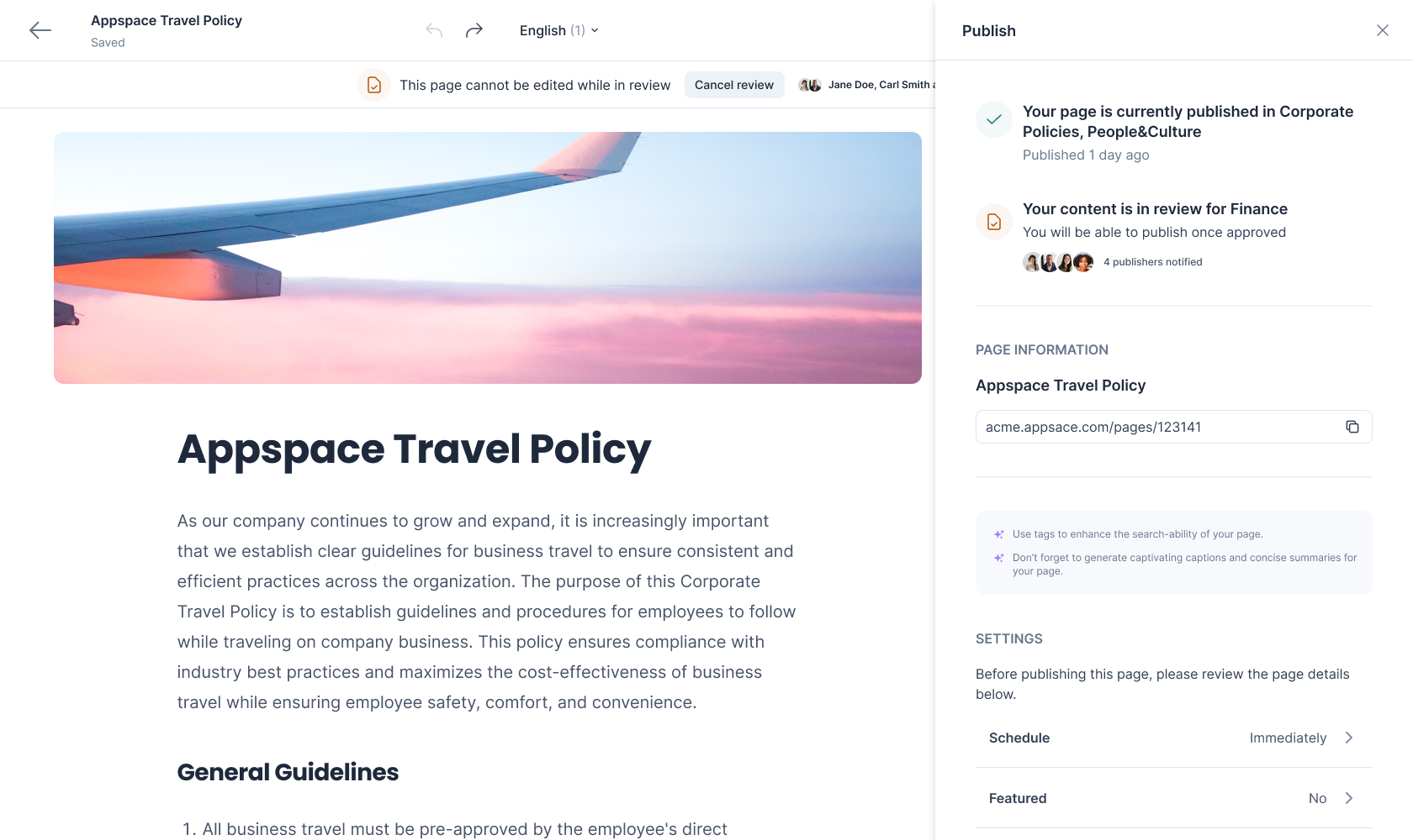
The final design of the content approval system, including a soft, flexible approval process.
Core design decisions
-
Non-blocking feedback mechanism: Implemented a collaborative review model where stakeholder input doesn't halt the publication process, allowing authors to maintain content velocity while incorporating feedback.
-
Dynamic reviewer selection: Enabled authors to include any stakeholder in the review process, with intelligent suggestions based on channel ownership and content type.
-
Simplified feedback interface: Reduced cognitive load for busy reviewers by implementing streamlined text-based feedback rather than complex annotation systems.
-
Configurable approval levels: Designed the system to accommodate varying organizational needs, from lightweight reviews for routine content to more structured processes for high-impact communications.
This research-driven approach shifted the solution from a one-size-fits-all approval gate to an adaptive workflow that respects organizational hierarchies while maintaining operational efficiency.
Pathfinding System
Problem
The need and the value of a pathfindind/wayfinding sytem for customers was already clearly validated. Among Appspace customers, many had multiple entire buildings with external visitors, for which finding their way around the building was essential. I was tasked with designing the admin and end-user experience.
Approach
The main struggle in this project were technical limitations. This feature was all about communication with developers and managing downgrades as we went along, while still shipping a feature that provides value. My vision faced constant challenges and I had to review my design constantly in order to make sure everything made sense.
It seemed initially that we would be able to leverage computer vision to recognize hallways and walkable areas, saving the user some time. Unfortunately the developers came back from a spike not feeling very confident with that route, and instead I had redesign the feature based on a path-tracing system.
A first concept based on the idea of auto-detected, editable walkable areas
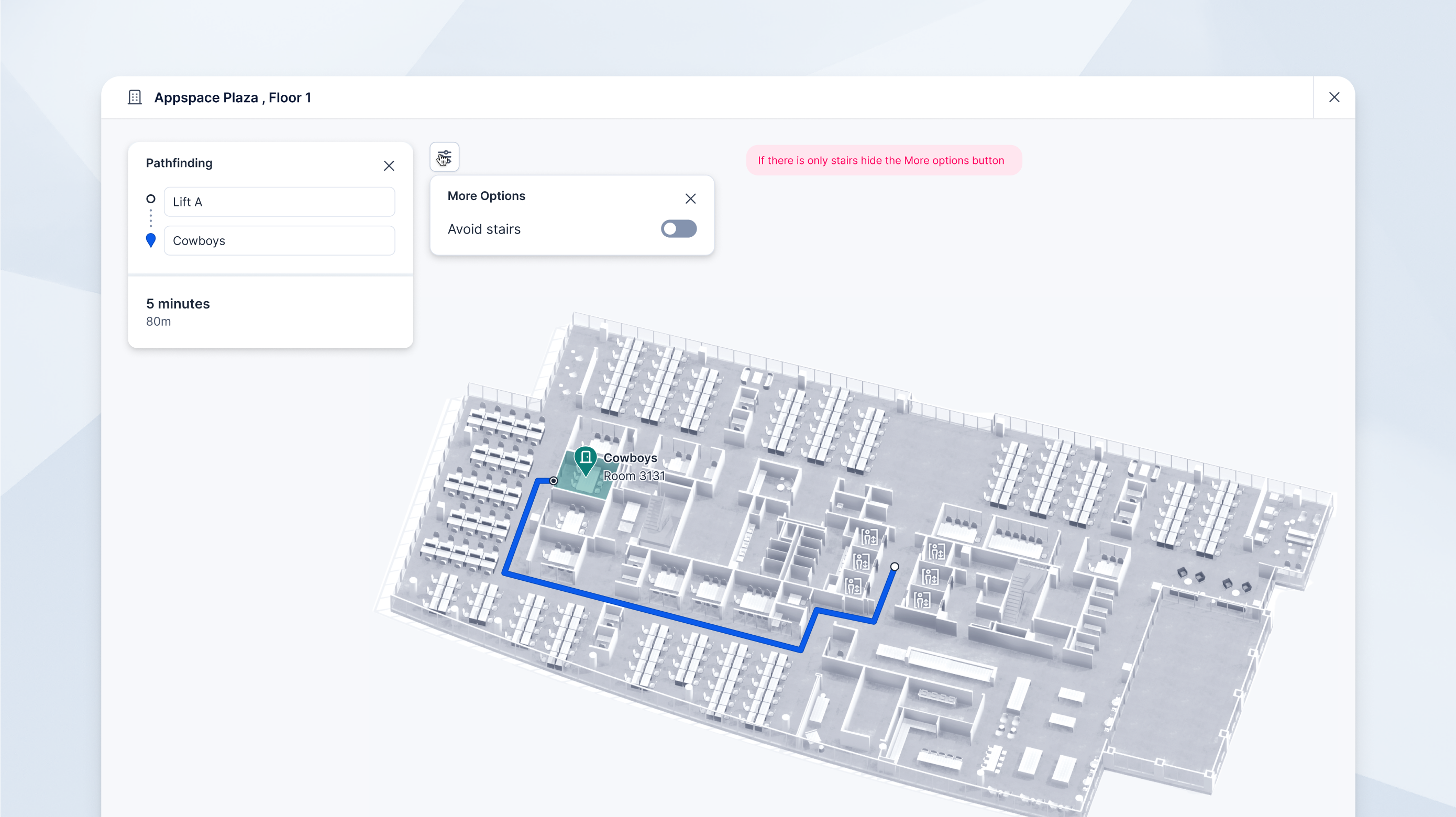
Path tracing involves the admin manually tracing a path through the building connecting all the resources, and when the end user (employee or visitor) searches for a resource, the A* algorithm will find the shortest path between the resource and the entrance of the building, or any other POI the user has chosen.
However, there were a few challenges that we had to overcome:
- The admin needs to be able to trace the path manually, and the path needs to be editable.
- Somehow the path needed to take the user to the entrance of resources, and avoid obstacles like walls
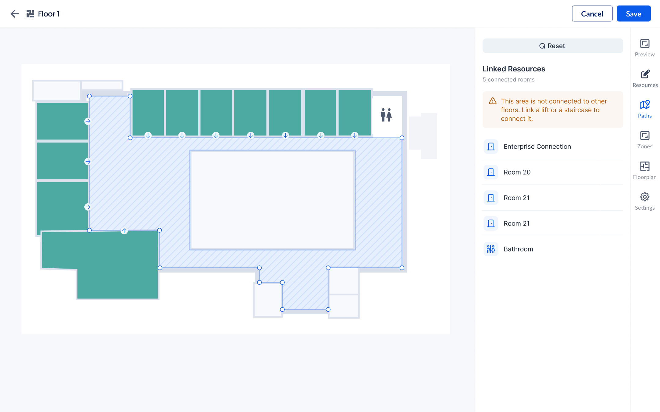
- The path needed to be able to connect multiple floors of the building through specific stairs or elevators. However, not all elevators are accessible from all floors, so I had to keep that in mind.
- The admin needed to be able to define the entrance of the building, and a connecting POI on each floor
Design Solution
I came up with a simple path tracing and editing UI, where the path would automatically connect each resource to the closest node, but with the possibility to edit connections. This avoids arbitrary paths through walls and obstacles. The entrance of each resource can also be moved easily on the same view for further accuracy.
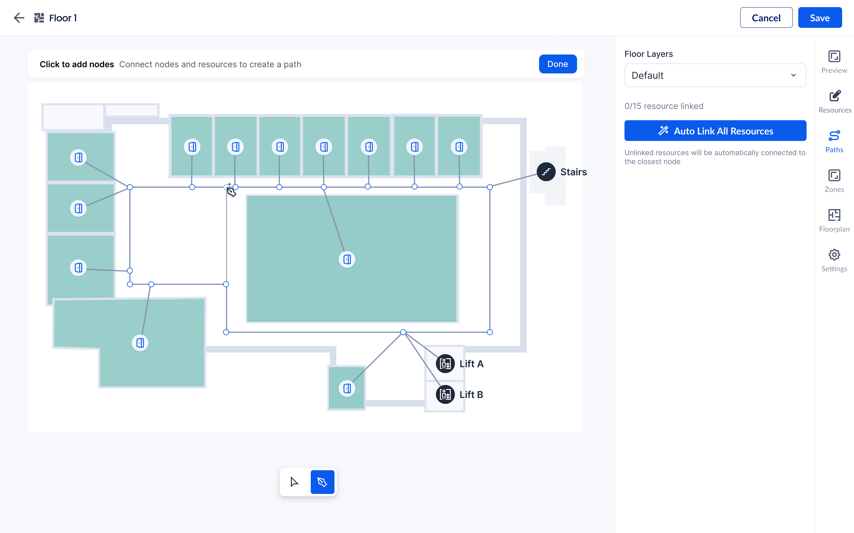
Path tracing and editing UI
The final design also involved some additional settings only for certain types of POIs (stairs, lifts, escalators...) with a Vertical Navigation ID which would link the POI on multiple floors. This way, it's possible to create a system in which Lift A only goes to even number floors, and Lift B only goes to odd number floors for example, or any other type of complex setup common in high rise buildings.
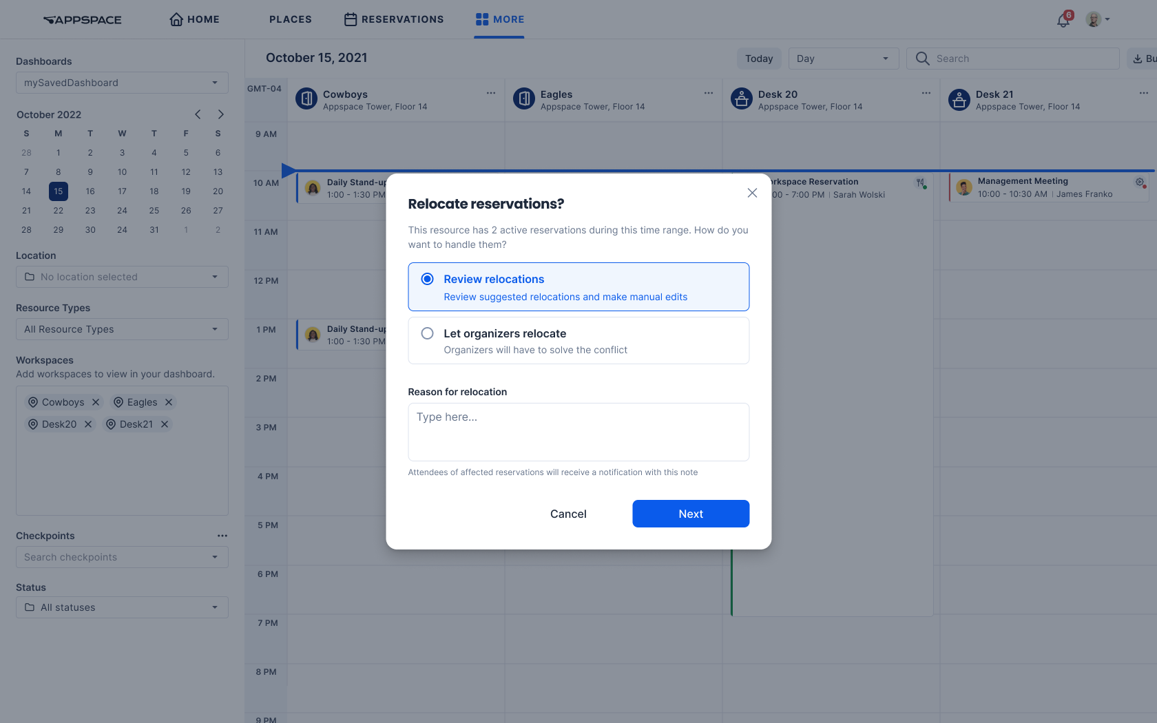
Smart Relocations
Problem
This feature served two different use cases for two different users personas: the facility manager and the concierge. Facility managers needed to be able to easily schedule maintenance for specific resources, and concierges needed to easily override bookings for executives or other high-profile users, while relocating exisiting reservations easily.
Approach
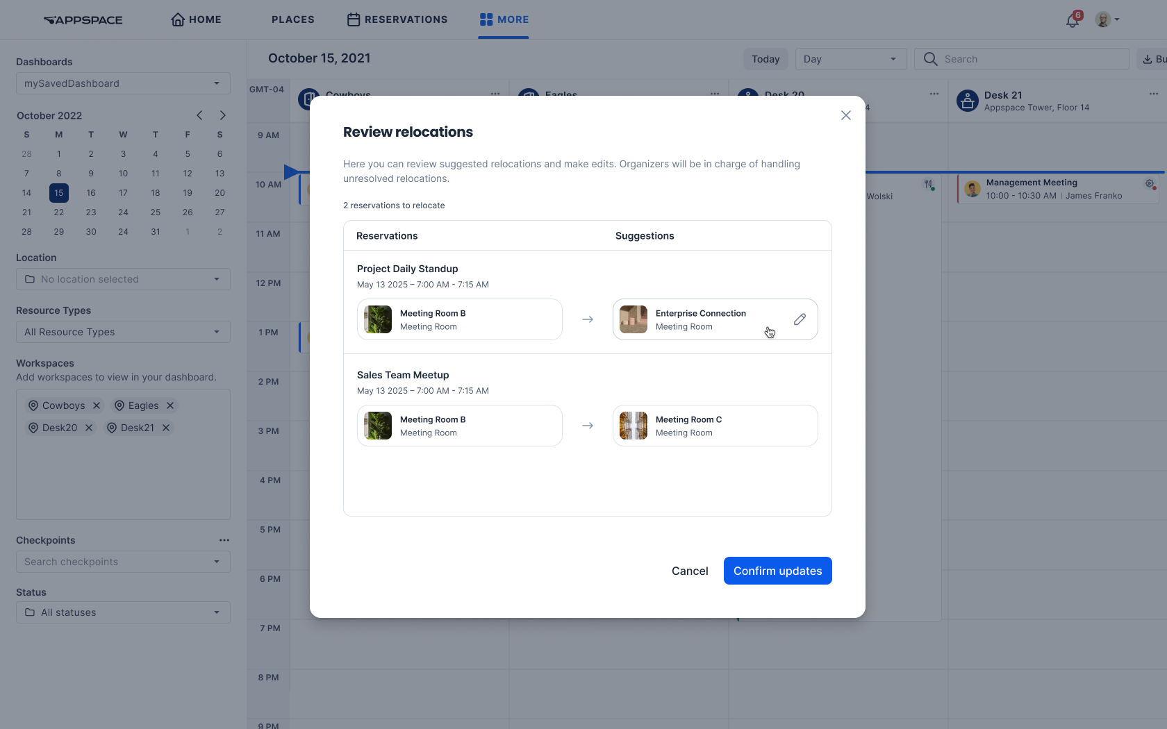
The approach was to create a single 'relocation' flow that would be used by both user personas, but with different entry points. The flow would be flexible enough to suggest relocations, while giving the option to change the relocation details if needed, or leave it up to the organizers to relocate.
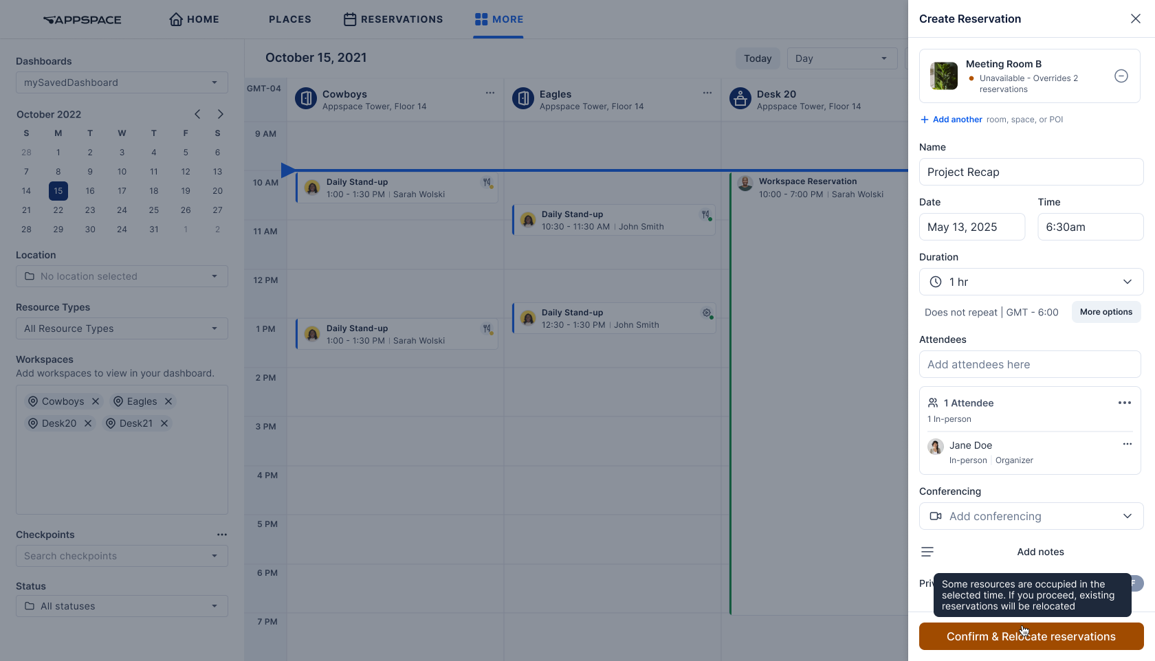
Entry point for the concierge, where they can override an unavailable resource
The start of the relocation flow. The admin/concierge can choose to either get suggestions for relocations, or leave it up to the organizers to choose the new room.
Schedule maintenance dialog, the entry point for facility managers
Challenges
This feature was challenging because it touched heavily on internal APIs with their limitations, and core concepts of the Appspace platform like rules and resource states. Appspace users have expectations for how the system works, and it was crucial to keep that in mind when designing the feature. For example, users can set a rule for resources to be 'locked' during the reservation process, for around 15 minutes (but this can be configured). However, we concluded that this could not be applied for relocations, because it would explode complexity and would be heavy on the backend, while we needed suggestions to be as fast as possible.
Surfacing Availability in Space Reservation
Problem
Inside Appspace's space reservation system, customers could only see a list of available spaces, but not the availability of the attendees, because it was not connected to the provider's calendar. This feature would allow customers to see the availability of the attendees within the reservation process, but it required a few tweaks to the UI to integrate it in our time suggestions, and make the suggestions transparent.
Approach
For this feature, I designed and vibecoded a functional prototype with Cursor, in order to test edge cases, UX impact, and have something visual to show to the team.
Key considerations
The final design solution had to keep into consideration our positioning as a mainly a space reservation system, not a replacement for Outlook or Google Calendar. One of the most important things for a useful feature in this case, was the transparency of the system. Appspace's reservation system already had some time suggestions for resource availability, so it was crucial to make clear why certain time suggestions appeared, because for certain edge cases it might not be possible to calculate either resource availability or attendee availability.
Design Solution
My solution was to:
- Show up to 3 time slots in which the resource is available, and the highest number of attendees are available. Priority is given to the resource availability since we're a space reservation system first.
- Still provide the flexibility to find a time slot that works for the attendees, but under a dropdown in the attendees section, so as not to clutter the UI for the main flow.
- Show the availability in a way that was familiar to users of Outlook or Google Calendar, with a clear label indicating the availability of the attendees. This way the logic is transparent to the user: it works the same way as before, but with availability for attendees. Only the best time slots show among the ones that are available for the resource.
Link Tiles Feature
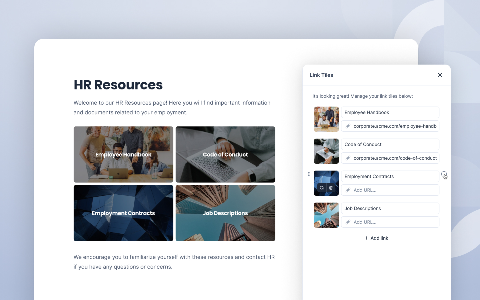
Challenge
Multiple customers requested the ability to add links to images, seeking to replicate promotional content patterns from their previous WordPress intranets. Initial analysis revealed this specific request masked a broader need for flexible content promotion capabilities.
Strategic Solution
Rather than implementing a narrow solution, I identified Link Tiles as a more valuable alternative that addressed the underlying user need while providing broader utility across the customer base. This strategic pivot delivered greater long-term value despite higher development costs.
Cosmos Design System
I followed and contributed the evolution of Cosmos, Appspace's design system, from a single component to 30+ production-ready components with full Storybook documentation. As the design team scaled from 3 to 10 designers, I architected a scalable system that maintains consistency across teams while enabling efficient collaboration between design and development.
Component Architecture & Toolkits
To prevent system bloat as we scaled, I designed a modular architecture with specialized toolkits for different product areas, allowing teams to import only necessary components for their features.
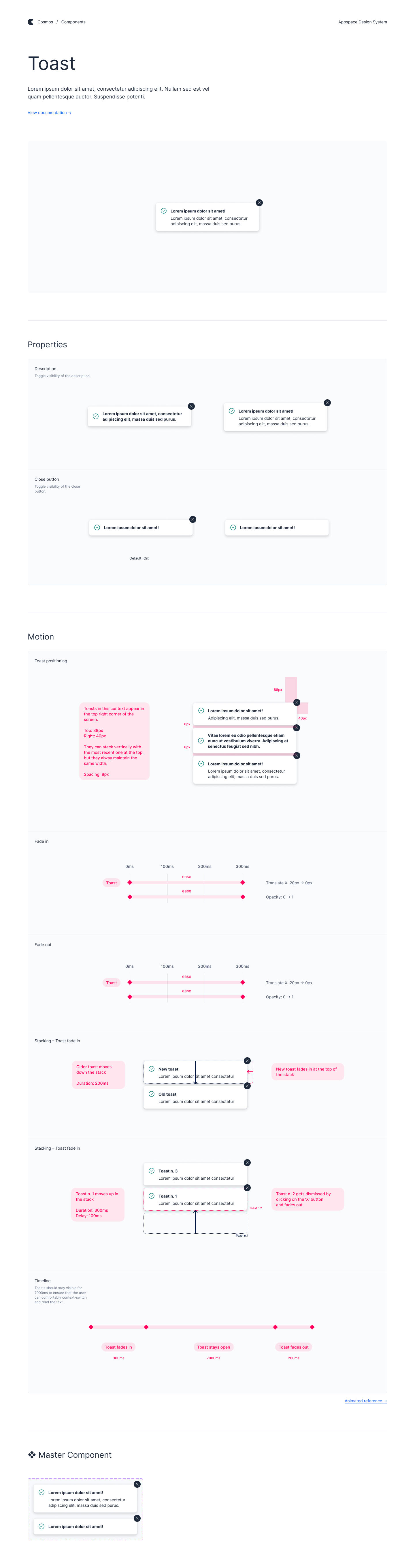
An example of the documentation page of a Cosmos component in Figma
Editor Component Rationalization
I led an initiative to consolidate fragmented editor variants that were causing maintenance issues across the development team. Through cross-functional collaboration, I identified usage patterns and established two core editor types:
- Editor Full: Comprehensive formatting tools for content authors
- Editor Lite: Streamlined version for user comments and posts (3 size variants)
This standardization reduced development complexity while maintaining design flexibility across use cases.
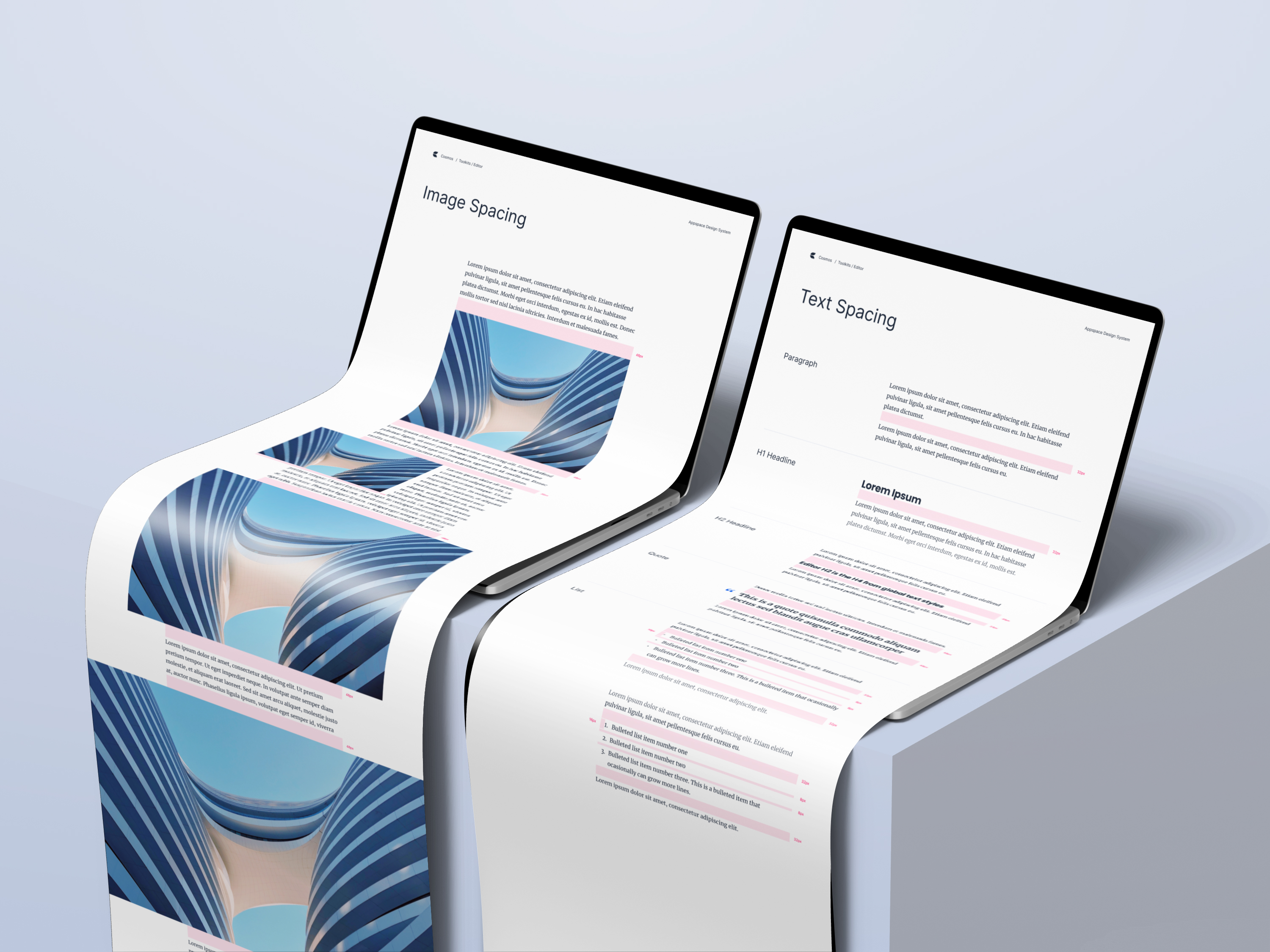
Template System
I developed a responsive template system with comprehensive breakpoint documentation, creating scalable page layouts that maintain consistency across device types.